Colour schemes in interior design
Have you ever wondered what’s the difference between tint and tone? Or shade and hue? Are all these words really different? Or do they mean the same? And why on earth can’t they just say colours if that’s what they are?!
I will try to make it all clear for you. So next time when you’re in your local DIY store you can speak like a pro! But first things first.
What are primary and secondary colours?
Red, blue and yellow are the primary colours. They represent the first colours on the colour wheel. Those three colours cannot be produced by mixing other colours. They are not very often used in their pure form but can be combined to make all the other colours.
By intermixing primary colours we can make another three colours. These are called secondary colours. By mixing red with blue we get violet, by mixing blue with yellow we get green and when mixing yellow with red we get orange colour. Easy, right? But what on earth are tertiary colours???
The tertiary colours are also called intermediate. To make them colours we mix primary colour with secondary colour that lies next to it on the colour wheel. There are six tertiary colours in total: red-orange, orange-yellow, yellow-green, green-blue, blue-violet, violet-red. Now let’s cut to the chase.
Explanation of tint, tone, shade, hue.
Hue is the correct name for colour. There are three areas in which colours are measured. Hue is the predominant colour, the purest and the brightest. Saturation is the colour intensity, and the luminance, which is the lightness of the colour. Three primary, three secondary and six tertiary colours on the colour wheel are the hues.
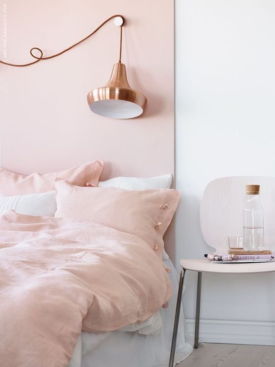
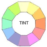
Tint is a colour with some percentage of white added to it. Any colour from the colour wheel can be altered by tinting. They could be extremely pale, almost white (high percentage of white) or almost as pure as a hue (low percentage of white).
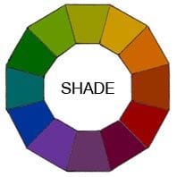
Shade is a colour with some black added to it. Just like with tints, any colour from the colour wheel can be used as a base of a shade. They can be nearly as dark as black or almost as pure as a hue.
Tone is a colour mixed with grey. It refers to how light or dark is the colour. Just like with tint and shade, any colour from the colour wheel can be used as a base of a tone.
Now let’s get to the fun part. The part where you actually get to look at some examples of colour schemes in interiors. For me, personally, colour is the most important element of a good designed interior (more on those elements in another post). But that doesn’t mean you have to go crazy with pink, red or blue. Black and white are colours too! And there is nothing wrong with liking just one colour either. But knowing what colours you like is a good starting point for creating your perfect home.
The meaning of complementary, monochromatic and harmonious colour schemes
Complementary colours are the colours that are opposite each other on the colour wheel, like: red and green; yellow and violet; yellow-green and red-violet, etc. When decorating with complementary colours it is always best to use one as a main colour (on the walls) and its opposite colour for the accessories. Not giving equal weight to each colour and let one stand out a little bit may also do the trick. Complementary colours in interior design can create a very dramatic and vibrant look, but they need to be managed well to avoid being jarring.
Monochromatic colour scheme is wrongly associated with all black and white interiors. But actually it is when only one colour is used. It can include any lighter tints, darker shades and grey tones of this one colour. Basically when design is based on one colour in varying tones, that’s when we call it a monochromatic scheme. If that’s the look you fancy you have to remember to introduce different finishes and texture to avoid looking it bland. Because white and black are the tint and the shade of every colour (that’s when a maximum of white or black is added to the colour), therefore all black and white interiors are called monochromatic.
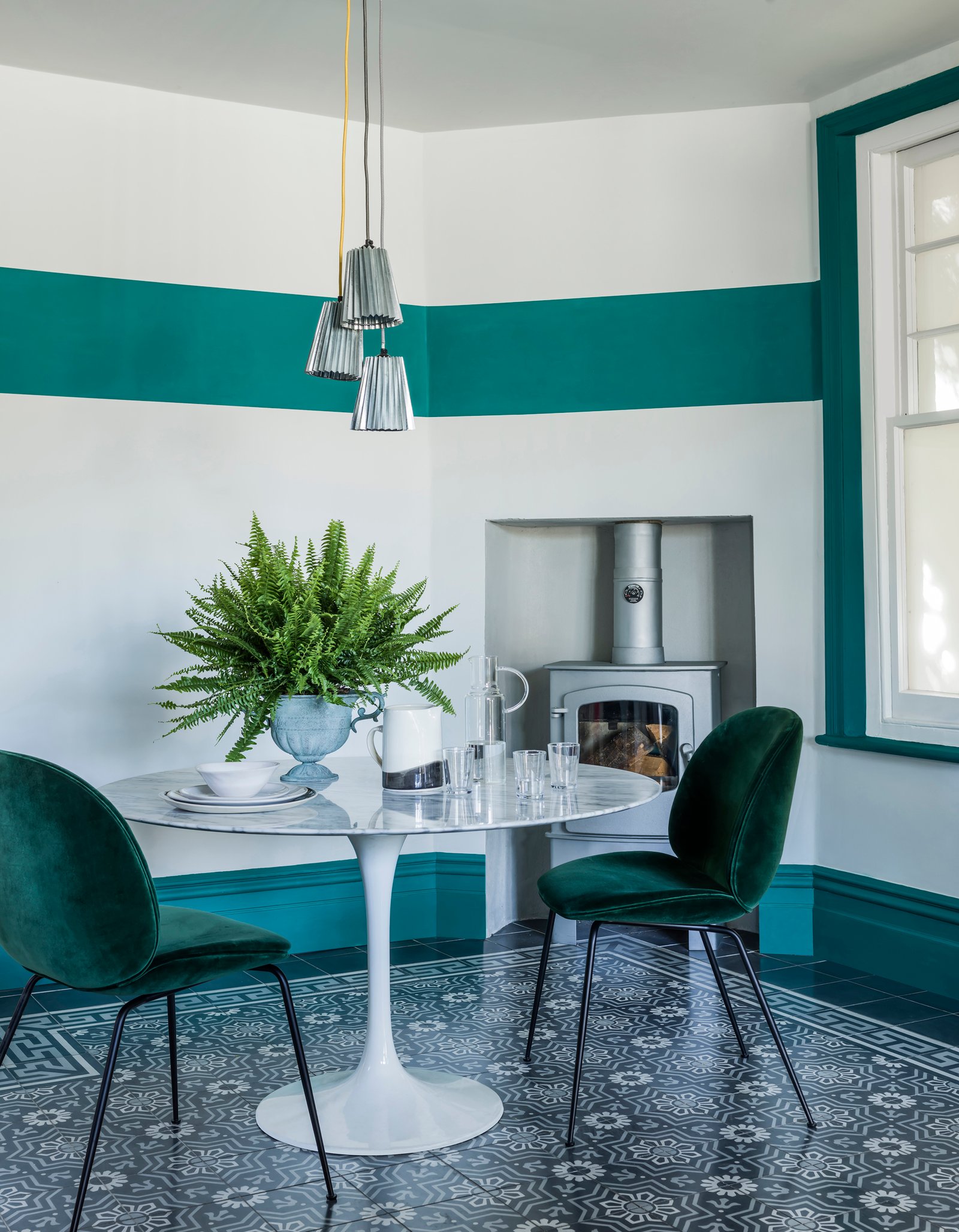
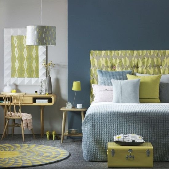
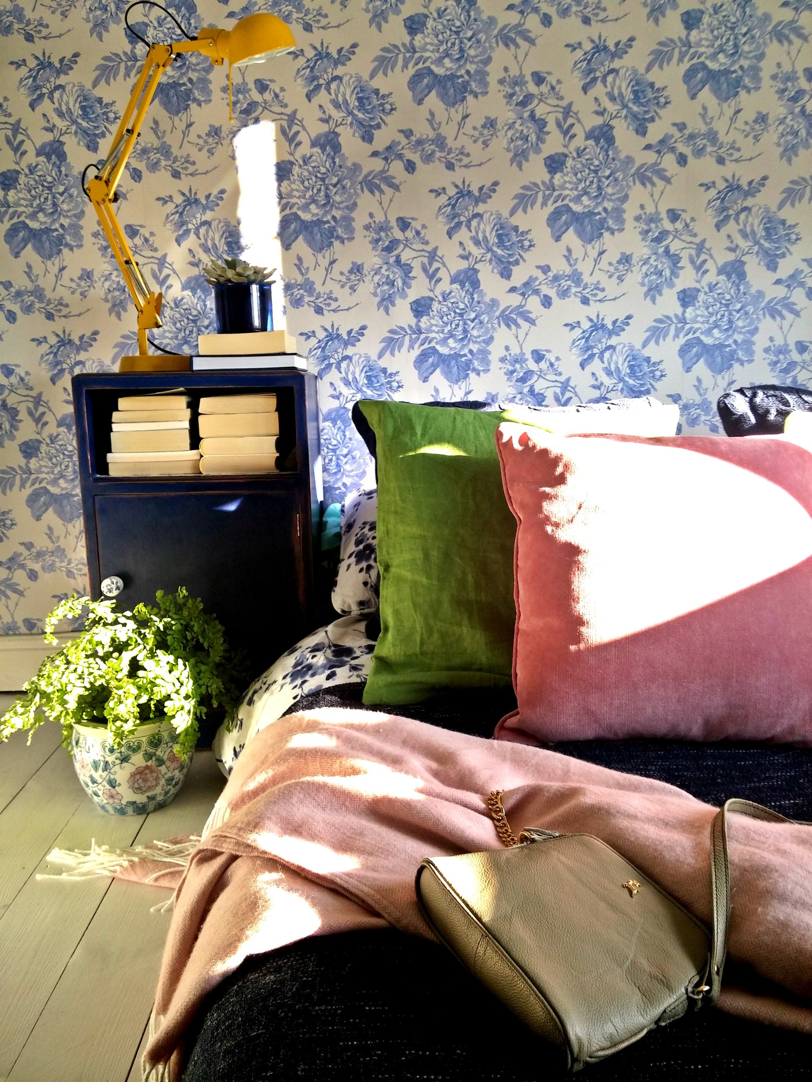
Harmonious colour shame, also known as analogous, is when colours that sit next to each other on the colour wheel are used (yellow and orange, green and blue, red and orange, etc.). When designing a harmonious room shame and using number of colours it is important to use them in the same tone, which will tie the look together. Harmonious means harmony so when the colours are used wisely they can create very beautiful and comfortable interiors. So if you’re not an experimenting type, this colour scheme is for you!

If you want to try experimenting with darker colours check out my post here or here for how to use dark colours in the garden.
Zapisz
Zapisz
Zapisz
Zapisz
Zapisz
Related News
2 Comments
Reply your comment Cancel Reply
This site uses Akismet to reduce spam. Learn how your comment data is processed.






Caroline
May 30, 2017A fab explanation, thank you. Love your yellow lamp, it works so well with the yellow lamp. Now I need my husband to read this and perhaps he’ll understand why a bright blue t-shirt and khaki camo shorts should never be worn together. ; )
Anonymous
May 30, 2017Well, I’ve given up on explaining why, instead I buy him cloths myself 🙂